Phoebe Bronstein and Clint Stivers
As teachers of multimodal/WOVEN artifacts, we naturally understand how to teach students how to arrange images for effective designs in posters, presentations, infographics, and other visual mediums. Despite having experience in visual rhetoric, some teachers express difficulty in how to approach teaching film. In this spirit, with our brief series on film form, we want to take the opportunity to break down the stylistic elements of film and television–to provide an introductory how-to guide with examples for teaching moving images in the classroom.
Boiled down to its most basic stylistic elements, a film or television show consists of a number of shots–of something, presented in a certain way–systematically arranged through the process of editing and accompanied by a soundtrack.
Film style is made up of four general categories: mise-en-scene, cinematography, editing, and sound. The first two‑‑mise‑en‑scene and cinematography‑‑relate to each individual shot, while editing, relates to the ways that shots and sounds are assembled into a coherent whole. Lastly, sound, consists of the various kinds of sound from dialogue to sweeping John Williams scores, laughtracks, and noise/sound effects (think the sound of uzis spraying bullets) that accompany the visual image. Ultimately, film style functions to communicate meaning, evoke emotions, and often–though not always–tell a story.
For our first post, we will focus only on mise-en-scene, while later posts will look at how other formal elements work in conjunction with each other. We hope that the following outline of film style over the next four posts provides you with a framework or foundation that will allow you to think, talk, and most importantly, teach how style functions in any film or television show.
Mise-en-Scene
When we teach formal analysis, we both generally start off with mise-en-scene and then work through the formal elements in order of their invention–mise-en-scene, cinematography, editing, and sound. For instance, early films were primarily interested in mise-en-scene (shot using long takes without any editing). They were experiments which captured, experimented, and made a spectacle of motion. Filmic storytelling came later. Check out these early Edison films (often a hit with students, especially “Boxing Cats”) for a look at early film form:
Edison: Boxing Cats & Sandow
Lumiere Bros: Arrival of a Train at a Station
Mise-en-Scene Defined:
Mise-en-scene (or, the “what” of the shot) is a French term borrowed from the theater which simply means “putting or placing into the scene.” It includes all of the elements placed in front of the camera to be photographed: the sets and props, lighting, costumes and make-up, and actor behavior.
1. sets and props
2. costume and makeup
3. lighting: intensity (“high key” or “low key”) direction, and sources (key, fill, and back–
Hollywood 3-point lighting)
4. character expression and movement (not character actions, but facial expressions, gestures, and
how the characters move)
Sample Analysis of Mise-en-Scene: Downton Abbey Opening Sequence
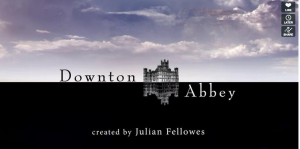
In the opening sequence, the contrast between light and dark spaces enforces the crucial class differences between servants and residents of Downton Abbey–a distinction reiterated in the bisected title screen for the series. The opening outside shot and subsequent shots of the upstairs are bright and filled with white light, while the downstairs remains dark and shadowy. This juxtaposition of light and dark sets up the class distinctions so vigorously maintained, yet under threat, within the drama. The only bodies we see in this sequence are in pieces: the legs of the Earl of Grantham (or so we presume) saunter in the natural sunlight towards Downton, a hand covers a kettle as another meticulously arranges the plates on the nobles’ dining table, and a young maid covered in shadows (low-key lighting) hurries up the stairs. This segmenting and obscuring of the people who inhabit–and are at the mercy of–the house emphasizes the very importance of the house itself over its residents: in the first shot, the gray stone towers rise out of the bright green grass. The structure appears imposing and majestic, sensibilities reinforced by the stark contrast between the grass and the building. Indeed, as the series progresses, Downtown becomes not only the main character but its maintenance, history, and function drive the narrative forward. Ultimately, as the opening sequence represents the distinction between classes, so too does it showcase that the home itself remains an everlasting and almost unmovable symbol of those class distinctions that the drama explores.
Sample Mise-en-Scene Practice:
1) Choose a short sequence and watch 2-3 times.
2) Ask students to take notes on what they see from props to costumes and body language.
3) Ask students to describe what they saw.
4) Push them towards analysis: What do we learn about the characters from their clothing? Their facial expressions and how they move? From the lighting? From the sets and props?
In the coming weeks, we will be submitting posts outlining the other three (and most difficult) aspects of cinematic style. For the time being, however, we hope this post on mise-en-scene can help those interested in teaching film and television texts.
If you would like to read more about work Brittain Fellows have done with cinema, feel free to check out a companion piece to this article, “Framing Media Studies, Part II: Cinematography,” by Phoebe Bronstein and Clint Stivers. We would also invite you to listen to the podcast series “Technically Pop,” produced by members of the WCP’s Podcast Committee.


Pingback: For more on Mise en Scene | Make 'Em Laugh
Pingback: Framing Media Studies, Part II: Cinematography - TECHStyle
Pingback: Teaching Media Studies Series @ GT | Phoebe Bronstein