
Jill Fennell consults with a student team in 2018.
By Jill Fennell and Jeffrey Howard
Technical Communication and Information Design Techniques in Assignment Design
Extant scholarship on technical communication, information design, and user experience design (UX) provides many ideas that instructors can implement to enhance the effectiveness and expand the purpose and usability of assignment sheets. We would like to address several of these ideas and demonstrate how their application to the problem of assignment sheets can potentially lead to a more profound and desirable classroom impact. These ideas include storytelling, problem-solving, memorability, and aesthetics.
Storytelling
According to Ellen Lupton, the foundation of design grounds itself in Gustav Freytag’s idea of the pyramid or “narrative arc” (exposition, rising action, climax, falling action, etc.) and Joseph Campbell’s theory of “the hero’s journey” described in The Hero with a Thousand Faces (22–4). Through language, structure, space, color, contrast, and other design elements, any design project intended to communicate a message, whether through a physical space, a brand, a logo, or a technical document, should tell a story. Communication students need to understand the impact that narrative can have on an audience because narrative not only provides cohesion, structure, and engagement, but quality design also promotes positive audience interpretations or impressions of that story. Teachers can begin demonstrating the power of the design/narrative relationship in the way they communicate instructions to their students through assignment sheets.
Figure 3: Fennell’s Audience Avatar Assignment Sheet (2020). This assignment sheet depicts how building a character can help solidify abstract concepts.
Part of this narrative design comes in the way instructors use these sheets to cast the students in their roles in their communication “journey”: the students, the heroes of these stories, will engage in a series of trials through which they will experience adversity and growth and at the end achieve a truly useful goal or build a useful skill. To make this happen, instructors need to know who their students are and what students want to accomplish and tie the communication and learning process to students’ values and goals in the way instructors talk about the assignment. Instructors can model this skill through their assignment sheets as depicted in Figure 3. Figure 3 models how an instructor fictionalized and narrativized her identity into a character that could be an effective audience avatar for a particular business client.
Additionally, instructors frequently tend toward relying too much on language in assignment sheets, which is why they so frequently end up as uninteresting, text-heavy documents. According to Lupton, language is only one element of designing compelling stories; there are also many visual design elements which instructors can use to communicate. Assignment sheets represent an opportunity for teachers to demonstrate how narrative design can work through strategies like unifying action, emotion, and perception.
- How is the document organized?
- How do processes and steps progress and build on each other?
- How do color and contrast promote engagement and feelings?
- How are the Gestalt principles of proximity, alignment, and negative space working together to show visual relationships in the layout?
Problem-Solving
In our classrooms, we strive to prepare students to enter a work force in which they will, hopefully, put their communication and critical thinking skills to work in order to identify and argue for solutions to the many complex issues that affect our society both locally and globally. The way we approach design in our communication classrooms should be a part of that preparation. In her article, “Design as Problem Solving,” Teena A. Carnegie argues that information design can be useful for teaching an audience (i.e. students) about problem-solving in three different ways:
- Design itself is the problem to be solved.
- Design provides solutions.
- Design implies a process of problem-solving.
Assignment sheets are one way instructors can begin the conversation about the relationship between design and problem solving. Carnegie writes, “Problem solving is not an innate ability; it is learned. As teachers of visual communication, we need to make problem solving more explicit, providing instruction, models, and opportunities for students to engage in various modes of problem solving” (47). For example, Figure 4 could be just such a model: it addresses some of the common difficulties or problems students experience with creating quality presentations (including visuals and body language) by laying out strategies or solutions in this simple but engaging design.
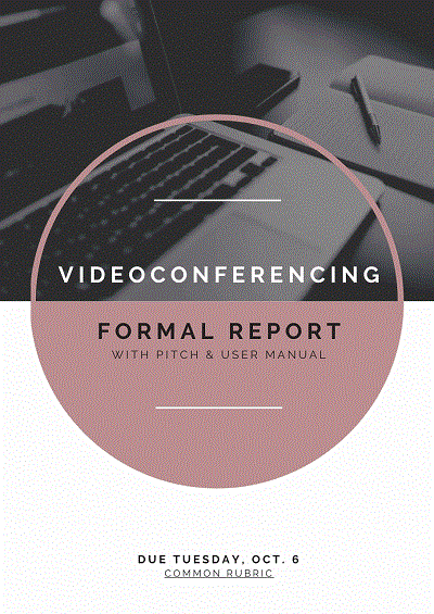
Figure 4: Fennell’s Formal Report Assignment Sheet (2020). This image shows how assignment sheets can take on the aesthetics of the genre they introduce. (Click on the image to view the full .gif.)
Using Carnegie’s ideas as a framework for analyzing our assignment sheets, we would like to provide some questions that instructors can ask themselves about how their assignment sheets can become opportunities for teaching students about problem solving. First, how can we solve the problems of designing a helpful assignment sheet that does not overcomplicate itself because of the complexities of the tasks that students much complete? One idea could be to set up a client visit situation in which the instructor acts as a client and students could be divided into groups. The instructor/client then talks to them about what the assignment components and objectives should be, and the students take notes and ask questions. Having intimate knowledge of the audience’s (the students themselves) needs, the groups then take that information and transform it into a navigable and attractive assignment sheet. The instructor then has each of the student groups do an analysis in which they report on the different rhetorical or aesthetic aspects of these sheets, using the information they received from the instructor as criteria for their reviews.
Second, how can we create a well-designed assignment sheet that will put our students in the best position to succeed in ways that are both ethical and efficient? Or, here is another idea: What if the instructor creates assignment sheets that resemble the kind of document the students need to create? These would not only give them the instructions, scope, and other things they need to begin working toward a successful project, but it could also simultaneously model design conventions they could emulate in their own design thinking and practices (See Figure 4). When we present the sheet, we can have a conversation with our students about our own design choices and how we used design to solve the problem of helping our students understand what we wanted them to do and learn by working on their projects. We can make explicit our endeavor to solve the problem of teacher ethos by demonstrating that we, too, are capable of working within the constraints of technical communication genres, as well as pushing against those constraints, to create a document that can function as both instructional document and generic model.
Third, how can our assignment sheets demonstrate problem-solving as a process? Carnegie writes, “Design becomes a cognitive activity by which the designer formulates and reformulates a problem to create original solutions. The designer moves beyond standard approaches, so instead of using design to create instructions that will be easy to use, the designer may explore why users do not use instructions and begin to examine other ways for the communication design to function instructionally” (36). This approach to design-as-a-problem-solving-process requires that students not only be aware of the way that they would initially think to solve a design problem, but also become familiar with multiple theories of problem-solving that can give them tools to create alternative design solutions. For example, genre theory could be one process of many to help students develop the critical thinking skills required to solve a design problem.
In “Teaching Toward the Telos of Critical Thinking: Genre in Business Communication,” Rebecca Morrison argues that business communication instructors should use genre theory to develop students’ critical thinking skills to be ready for industry needs. Morrison’s main point seems to be that by giving students genre theory as a way to respond, she provides them with more opportunities for communication considerations that help them understand “genre as a social action” (469). Having this exposure to critical decision making will create better products because students will understand how to modify genres we teach through the assignment sheet, students can more easily link their instruction to the social action they have been asked to create.
As instructors, we can talk to students about what theories of and approaches to problem-solving are available to them and what they entail. Then we show our students two copies of our assignment sheets, one a rough draft and one a more polished draft and talk to them about how we found solutions to our design problems and ask them how they might have approached the same problem. After our discussion, we could ask them to pick one problem-solving approach and apply it to the rough draft to come up with their own polished version that attempts to
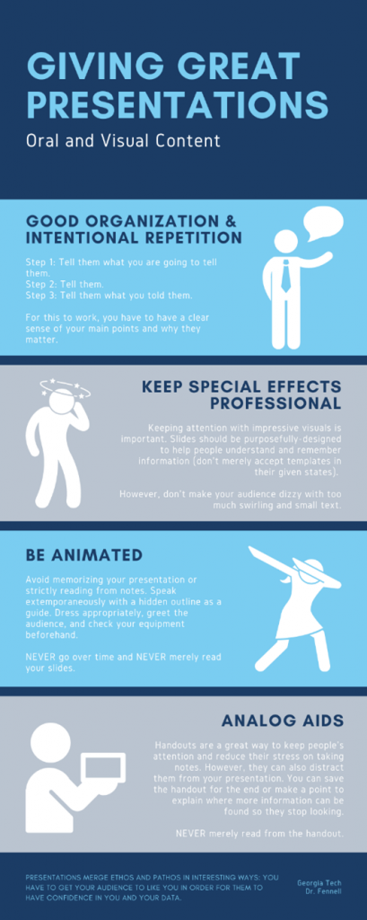
Figure 5: Infographic from Fennell’s Presentation Assignment Sheet (2020). This figure demonstrates how assignment sheets can use instructional graphics to clarify steps or processes.
improve on the instructor’s draft. The instructor might then consider collaborating with the students to implement elements from these multiple student-produced versions of the assignment sheet to create one more master draft that could become a kind of adaptable template for assignment sheets throughout the rest of the course. The instructor could then assign a brief reflection assignment in which the students reflect on and describe the ways that thinking about their prior problem-solving process and trying to use an unfamiliar process made them “formulate and reformulate” the way they attempted to solve a design problem. They should also describe the value that developing a problem-solving “toolbox” containing multiple theories and approaches to problem-solving can add to their professional profile.
Through similar hands-on activities, instructors can demonstrate how design itself can be an issue, but it can also be a solution or lead to solutions through diverse cognitive processes. It is also important that students understand that there is more than a single way to address a single problem, an idea that will help immensely in the collaborative environments they will need to contribute to in their future workplace. Assignment sheets can become a tool for promoting these multiple perspectives on the relationship between design and problem-solving.
Memorability
We want students to remember our instruction and the information on our instructional materials, but too often we do not make decisions that heighten the memorability of our materials. In “Making Memories: Writing and Designing More Memorable Documents,” Eric Sentell examines how elements of document design make information communication memorable. He finds that typical elements such as contrast, color, and imagery are important. However, for information to be encoded into long-term memory, the design decisions need to engage audiences’ “self-schema”: tap into their identities and what they see as relevant.
Sentell additionally explains that design principles should create a visual hierarchy that makes documents easier to understand and remember. For example, he states, “readers perceive fonts as having distinct personalities,” “type [such as bolding, italicizing, underlining, etc.] influences perceptions of a document’s ethos,” and color and contrast can “create moods, and symbolize familiar cultural meanings” (139–140). For example, Figure 5 shows a character dabbing. While this will most certainly come across as cringey to students—and definitely circa 2016—it will also resonate and make the instruction more likely to become long-term memory.
For his study, Sentell asked participants to walk down a high school hallway and then interviewed them about the posters/flyers they could remember. He interviewed them two hours after their viewing and then again one week later. He found that the most memorable designs “appealed to readers’ existing self-schema, or identities, leading them to ascribe relevance or importance to the information that made it worth remembering” (143). For example, Figure 6 appeals to the students’ self-schema as students because it prioritizes information they find critical such as the assignment’s weight, due date, and parceled steps for completion.
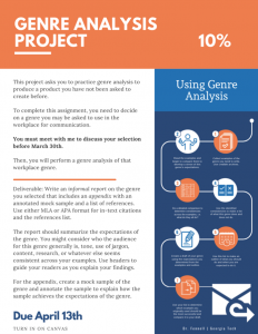
Figure 6: Fennell’s Genre Analysis Assignment Sheet (2021). Notice the use of color, negative space, and informational graphics as well as the language that emphasizes the assignment’s long-term relevance.
Sentell argues that while document designers are making decisions about contrast, color, etc., they also need to consider how such decisions might do more than merely attract attention, and instead actually improve memorability. He ends by providing the following “heuristic” for engaging collective schema:
- Convey practical value.
- Use contrast, color, and imagery.
- Tap the familiar.
- Use unexpected elements.
- Build social currency.
- Arouse emotion. (147)
Ultimately, techniques such as these can make instructional material more memorable for an intended audience; they also demonstrate a strong relationship between memorable design and aesthetic principles and choices.
Aesthetics
Aesthetics, or “beauty, style, and taste,” is an important component of design that Candice Welhausen argues has been “undertheorized” in recent scholarly conversations (133). Because communication is not just about transferring information from an author to an audience in the most efficient way, it should also include discussions of aesthetics and their potential emotional impact on or resonance with target audiences. Applying aesthetic principles or sensibilities does not mean adding insubstantial or functionless “eye candy” or “window-dressing” (the equivalent of what Edward Tufte might deem “chartjunk” in data visualization).

In the past, we have added memes and other cultural references to try to tap into the self-schema of students and gain their interests, but this can come across as inauthentic to students. We recommend instructional designers use graphics more relevant to the subject/task.
Perhaps we can think of instructors who fill their syllabi with thematically connected memes. Yes, this approach might promote engagement by providing more visually arresting content and making people laugh, but are they actually helping students understand the instructor’s expectations? Or are they essentially superfluous or, worse still, disrupting the logical flow of the document or cluttering the page? We need, to borrow from Dunn again, to keep “horseshit out of the picture” and hold on to the “necessary” (472), but gripping tightly to what is “necessary” does not mean throwing out form or aesthetics. Aesthetics are as essential as usability. Good composers should be striving to compose technical documents that are easy to navigate and use and pleasing to look at. By modeling sound aesthetic sense within their particular cultural context, instructors can use their assignment sheets, as mentioned in the previous section on problem-solving, to convey authority and credibility to their students and demonstrate the rhetorical power and engagement that can arise from paying attention to both form and function.
But when instructors create text-heavy paper or online assignments sheets, either in Word documents or in LMS pages, they marginalize the value of aesthetics. Luckily, it does not take a lot of time or money to self-educate about design tools or programs that can help an instructor make more pleasing assignment sheets. A program like Adobe InDesign might be cost-prohibitive and intimidating (It’s all those buttons!), but even a free and user-friendly platform like Canva can provide many design resources that can help instructors craft assignment sheets that are creative, colorful, multimodal, and dynamic. YouTube tutorials, too, can provide enough knowledge to make a design novice just slightly dangerous.
Ultimately, aesthetics do matter, and instructors can begin to send that message in their class by creating aesthetically pleasing assignment sheets. This approach to teaching aesthetic principles connects to the practice of “modeling” design for students, or in other words showing examples of effective and ineffective design to students and allowing them to dissect and analyze what works and what does not. Combining this definitional/descriptive approach is one way to create a shared, negotiated aesthetic vocabulary that allows for more dynamic discussions of how aesthetic principles function in real-world technical documents or compositions. It also shows students our own ethos as communicators who understand and care for our audience: them. In “Design Thinking in Technical and Professional Communication: Four Perspectives,” Rebecca Pope-Ruark interviews four scholars on design thinking; while the scholars disagree on much, all acknowledge that a key concept for design thinking is to empathize with the audience/user, even going as far as to say that design thinking’s value lies in “user advocacy” (447). Communication requires both parties to enter an ethics of good faith. One must have the faith their communication will be greeted with attention and care and the other must have the faith that their attention and care are merited and respected by the first. Using careful aesthetic design on assignment sheets emphasizes the good faith of our instructional material.
Moving Forward: Students Are Not Consumers & Other Reflections
More research needs to be done on this issue. Students should be interviewed, and interviews should be coded to develop concrete data on the benefits of using UX for instructional design. However, at this point, we offer the following recommendations based on the research discussed:
- Assignment sheets should build ethos between teachers and students by displaying teachers’ sound design choices.
- As possible, design choices should introduce and mimic the rhetorical situation of the social action students will be asked to perform.
- Assignment sheets should be memorable.
- Assignment sheets should provoke dialogue rather than simply facilitate one-way information flow.
- When designing assignment sheets, instructors should push against convention and lore if it will promote learning and skill development.
- Assignment sheet writers should make their materials easy to use, but avoid a user/buyer-seller mentality.
While the rhetorical work we describe in this article parallels or resonates with perspectives drawn from usability studies—and we are certainly interested in creating assignment sheets that are more usable for everyone in the classroom—we are not interested in casting students as consumers. First, the term consumer fits into a corporate model of education with which we are ideologically at odds. Second, if they were consumers, we would simply be interested in making their lives as easy as possible so they can achieve their goals in the most efficient and effortless way possible. That is not, however, and cannot be what we as instructors are after. We are interested in their learning (which is frequently difficult and challenging), using our classrooms as physical and virtual spaces to help them grow into the best intellectual, problem-solving, and ethically minded future citizens and community members that they can be. Our assignment sheets can be opportunities to advance that goal by implicitly and explicitly using design to reinforce course principles and invite discussions about information design/technical communication.
Using technical communication and information design as a framework for instructional design builds on shared skills both types of communicators—teachers and technical writers—already use, such as “planning questions” and “front-end analysis” (e.g. forecasting questions), privileging an iterative evaluation process, and the “interaction and equal importance of writing and presentation” (Redish 163). However, should we use technical communication and information design more consciously and proactively, we believe that instructional materials can have a greater impact on our students’ learning.
Works Cited
Carliner, Saul. “Physical, Cognitive, and Affective: A Three-Part Framework for Information Design.” Technical Communication, vol. 47, no. 4, 2000, pp. 561–576.
Carnegie, Teena A. M. “Design as Problem Solving.” Designing Texts: Teaching Visual Communication, eds. Brumberger, Eva R., and Kathryn M. Northcut, Taylor & Francis Group, 2013. pp. 33–48.
Dunn, Stephen. “Forms and Structures.” The Georgia Review, vol. 62, no. .3, 2008, pp. 472–81.
Dyrud, Marilyn A. “Design Guidelines for Written Assignments.” Proceedings Frontiers in Education 1995 25th Annual Conference. Engineering Education for the 21st Century. Vol. 2. IEEE, 1995.
Kendall, Anna. “The Assignment Sheet Mystery.” Writing Lab Newsletter, vol. 33, no. 1. Sept. 2008, p. 1. Gale OneFile: Educator’s Reference Complete, link.gale.com/apps/doc/A204036322/PROF?u=gainstoftech&sid=PROF&xid=de8467a5. Accessed 21 Jan. 2021.
Lupton, Ellen. Design Is Storytelling. Cooper Hewitt, 2017.
Marshall, James D. “Process and Product: Case Studies of Writing in Two Content Areas.” Contexts/or Learning to Write. Ed. Arthur Applebee. Norwood, NJ, 1984. 149-68.
Morrison, Rebecca. “Teaching Toward the Telos of Critical Thinking: Genre in Business Communication.” Business and Professional Communication Quarterly, vol. 80, no. 4, 2017, pp. 460–72.
Pope-Ruark, Rebecca. “Design Thinking in Technical and Professional Communication: Four Perspectives.” Journal of Business and Technical Communication, vol. 33, no. 4, 2019, 437–55.
Redish, Janice C. “What Is Information Design?” Technical Communication, vol. 47, no. 2, 2000, pp. 163–66.
Schriver, Karen. Dynamics in document design: Creating text for readers. John Wiley & Sons., 1997.
Sentell, Eric. “Making Memories: Writing and Designing More Memorable Documents.” Technical Communication, vol. 63, no. 2, 2016, pp. 136–53.
Simon, Linda. “De-Coding Writing Assignments.” The History Teacher, vol. 24, no. 2. 1991. pp. 149-155.
Sudol, David. “Rhetorical Situations and Assignment Sheets.” Strategies for Teaching First-Year Composition. Ed. Duane Roen, Veronica Pantoja, Lauren Vena, Susan K. Miller, and Eric Waggner. Urbana: NCTE, 2002. pp. 51-2.
Welhausen, Candice A. “Toward a Topos of Visual Rhetoric: Teaching Aesthetics Through Color and Typography.” Journal of Technical Writing and Communication, vol. 48, no. 2, 2018, pp. 132–150.
